NYC’s One-Stop Resource Center for Animals
Mayor’s Alliance for NYC Animals
Team
• Cristina Samper C. • Charlie Krawczel • Victoria Demetrio • Sully Follin •
Tools Utilized
• Figma • Adobe CS • Trello
• Google Sheets •

The Design Process
Part 1: Empathize
Stakeholder Interview:
We interviewed a company stakeholder to learn more about the Mayor’s Alliance site, and to understand what the most important needs are, as they see it. The site needs to feel like a seamless to use source of abundant information for pet owners in the city.
Current Issue:
Site is barely usable - potential users need help but they struggle to find it, so they resolve their issues in other sites
What’s Good:
There is currently lots of varied and valuable information that suits different users’ needs, we have the chance to attract a wide-ranged community
The Goal:
To increase volunteer participation and to make a big push for awareness in microchipping and spaying/neutering resources available for pet owners
In order to best empathize with potential users, we resolved it best to consider two types of user proto-personas that would utilize the Mayor’s Alliance website for different reasons, and their experience with the site as is.
Potential User A
Wants to give an animal a home
Goes to a shelter to start their search
Spayed/neutered prior to adoption per local requirement
Microchipping was a personal decision
Considers all factors before adopting
Searches shelters in person
Overwhelmed with all the options
Potential User B
Doesn’t like breeders for health issues
Searches online & reviews to start
Found their pet when already spayed/neutered
Hard to find microchip information after adoption
Looks for places that are vetted by reputable orgs and the local community
Searches shelters online
Overwhelmed with all the options
User Testing Results
Pain Point 1.
Problem: Search bar didn’t work
Solution: Create custom navigation system
Pain Point 2.
Problem: Nav bar is small and crowded
Solution: Simplify and condense into one
Pain Point 3.
Problem: Spay/neuter page had to much info, doesn’t know where to go
Solution: Break up the page using visuals and an a map
Pain Point 4.
Problem: Existing color palette looks stale and government-like
Solution: Give the colors a refresh to promote pet health and safety
Why This Will Work:
The City is vast and populous - no one knows it better than New Yorkers. Mayor’s Alliance is the main resource for information and veterinary care in NYC, so if we can ease the process of getting information for the user, they will return again and again.
Our Proposition
Therefore:
We are developing website redesign, reorganization, and branding strategy to help current and future pet owners feel at ease when important situations arise - medical or otherwise.
Both current and possible pet adopters in New York City are overwhelmed by all the options to find information they need. The current website for Mayor’s Alliance for NYC’s Animals does not currently relieve users from this stressful situation.
Part 2: Define
We formulated two user personas that best encapsule the myriad of pet owners in New York City.
User Persona 1: Margaret
Margaret Storyboard
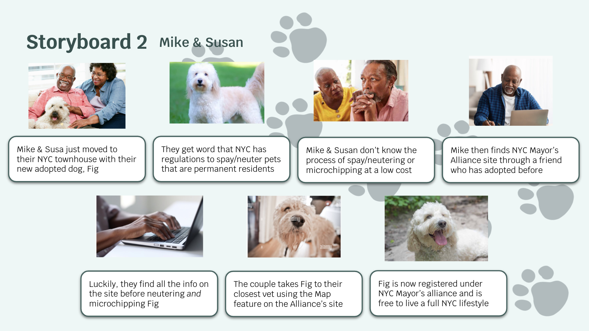
User Persona 2: Mike and Susan
Mike and Susan Storyboard
User Testing Results
Pain Point 1.
Problem: Search bar didn’t work
Solution: Create custom navigation system
Pain Point 2.
Problem: Nav bar is small and crowded
Solution: Simplify and condense into one
Pain Point 3.
Problem: Spay/neuter page had to much info, doesn’t know where to go
Solution: Break up the page using visuals and an a map
Pain Point 4.
Problem: Existing color palette looks stale and government-like
Solution: Give the colors a refresh to promote pet health and safety
Our Proposition
Both current and possible pet adopters in New York City are overwhelmed by all the options to find information they need. The current website for Mayor’s Alliance for NYC’s Animals does not currently relieve users from this stressful situation.
Why This Will Work:
The City is vast and populous - no one knows it better than New Yorkers. Mayor’s Alliance is the main resource for information and veterinary care in NYC, so if we can ease the process of getting information for the user, they will return again and again.
Therefore:
We are developing website redesign, reorganization, and branding strategy to help current and future pet owners feel at ease when important situations arise - medical or otherwise.
Part 3: Ideate
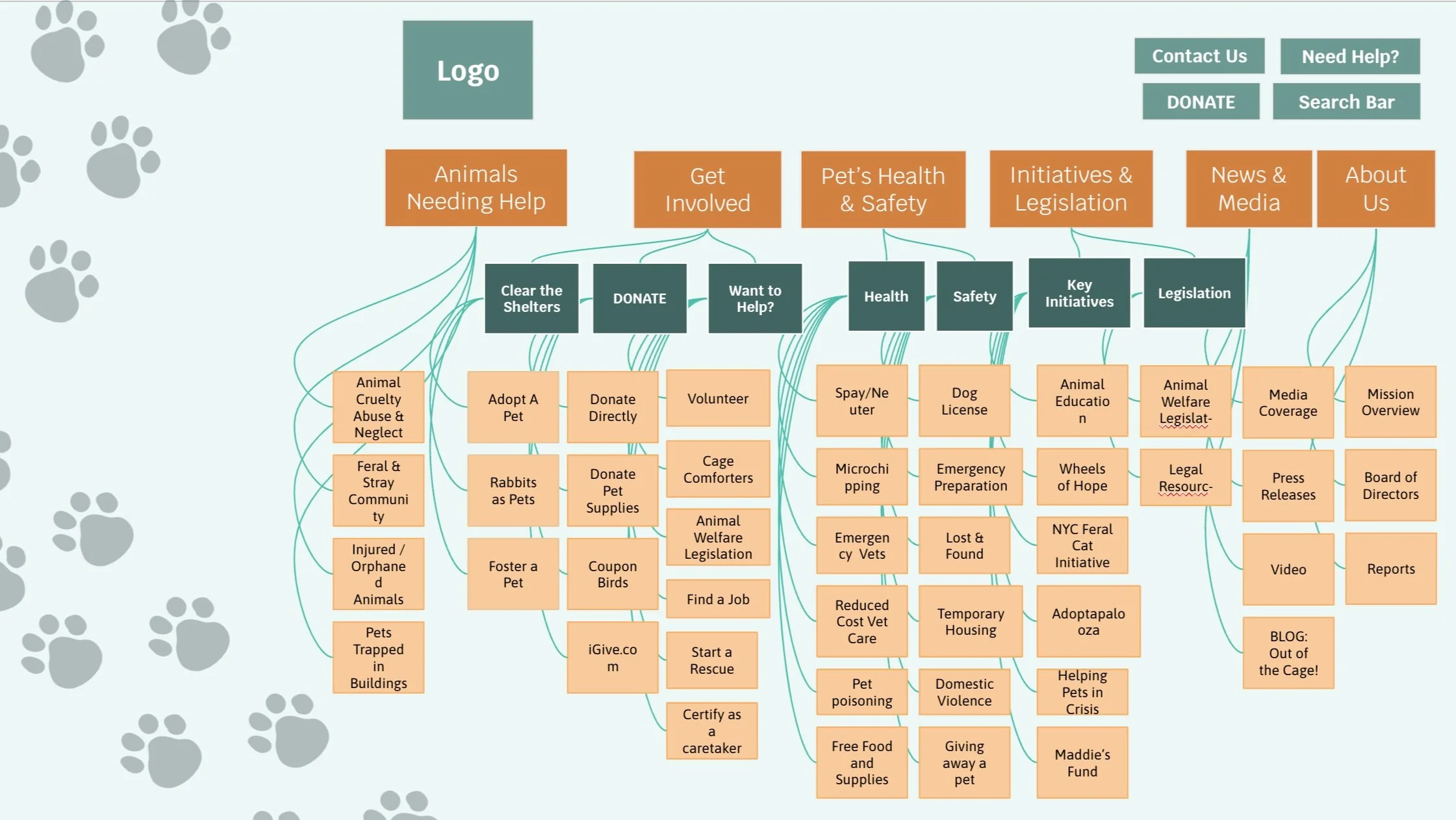
The original site includes two navigation bars which we found to be confusing throughout the evaluation phase. We opted instead to create a sub-category-type of site, where navigation is under a Topic Hierarchy system. We then generated a modified flowchart to match our new Navigation Bar.
Flowchart
Card Sorting & Re-Evaluation
Part 4: Prototype
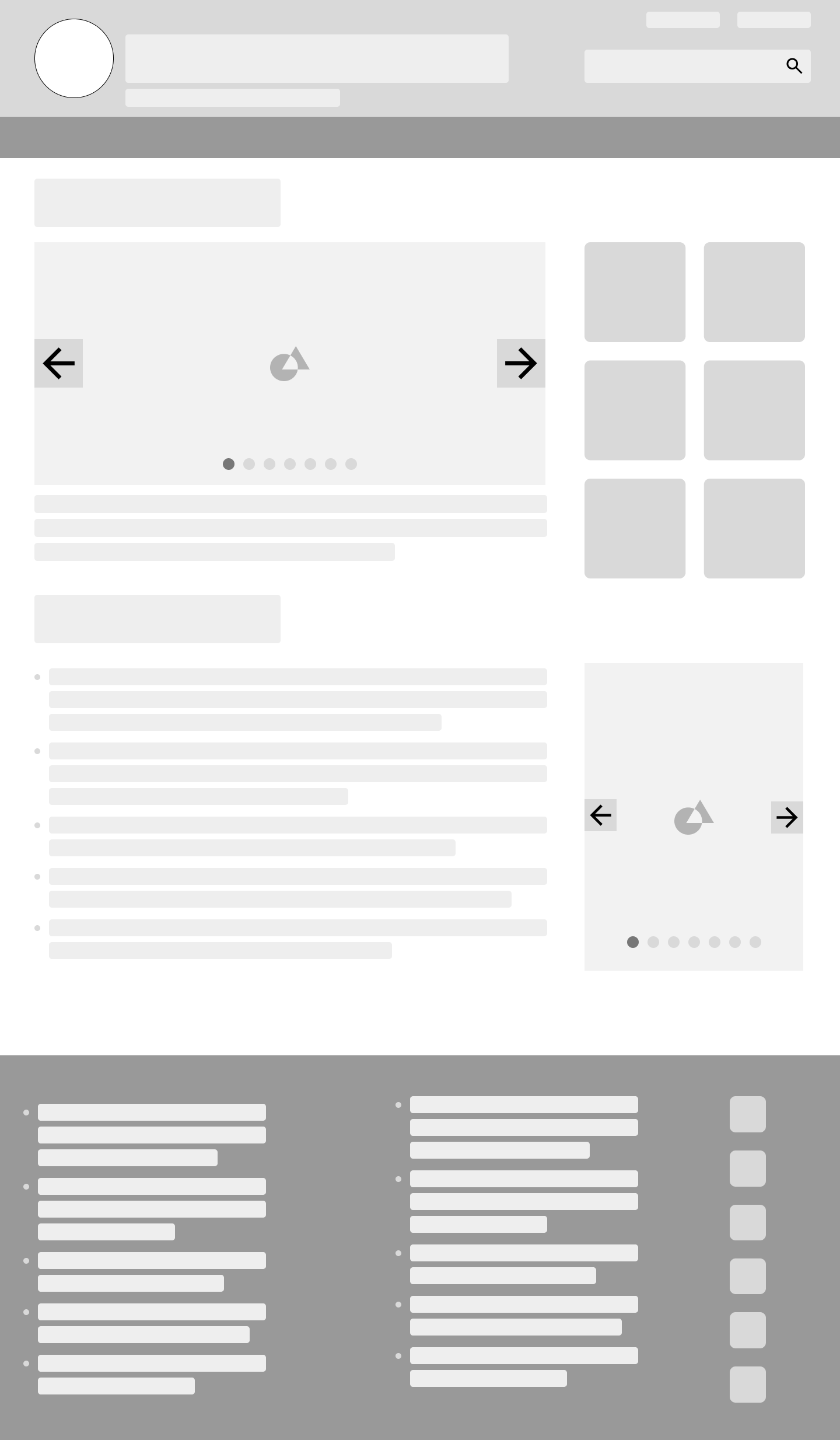
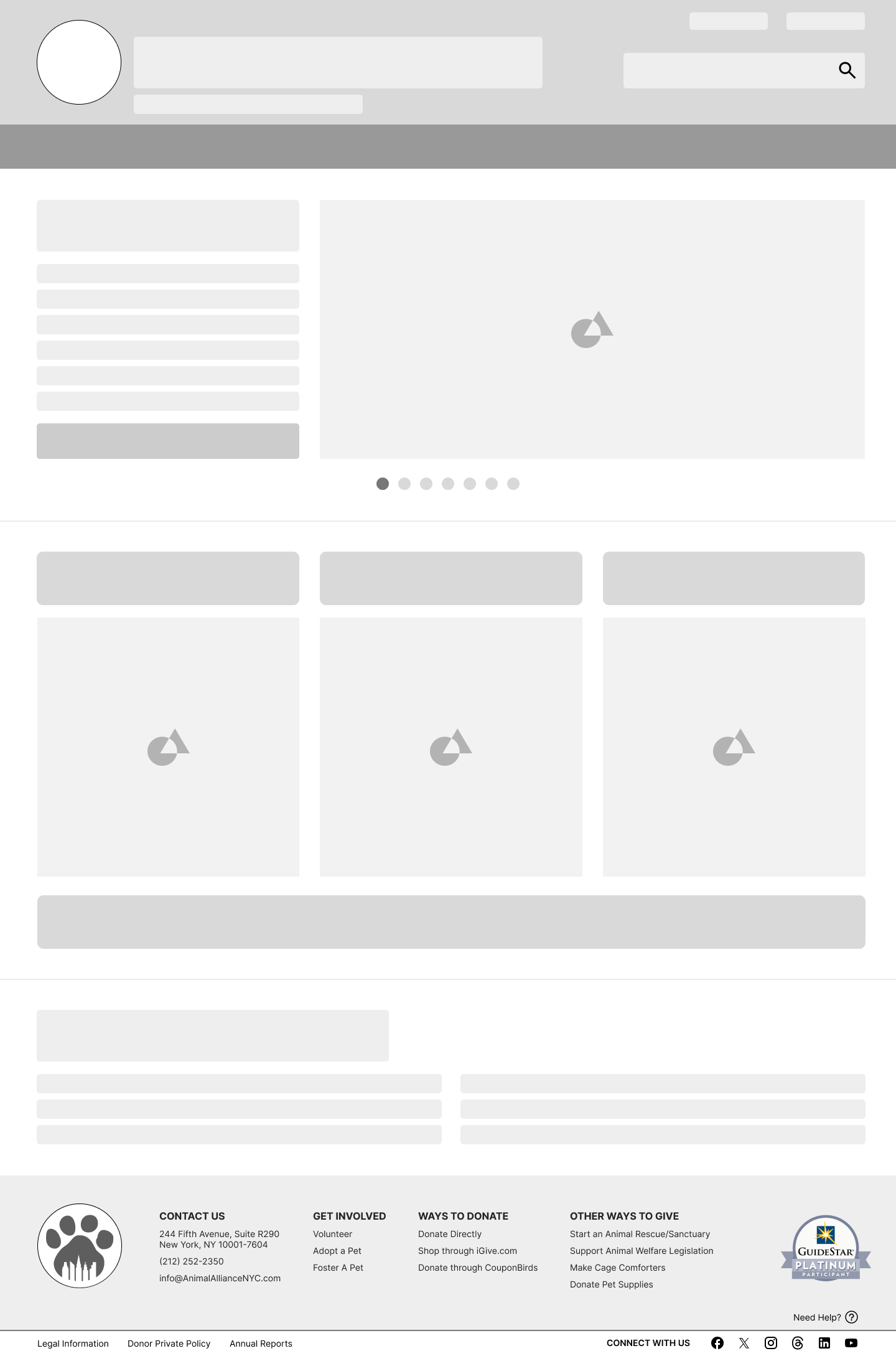
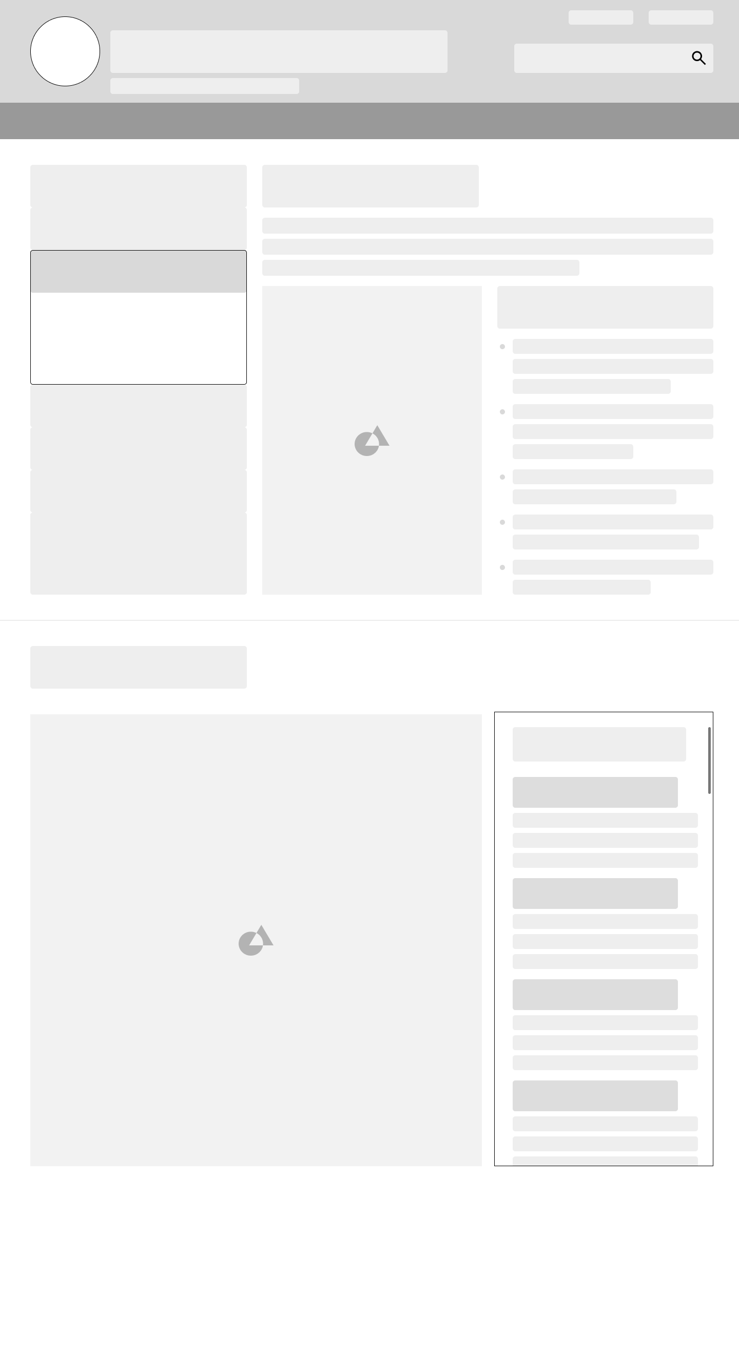
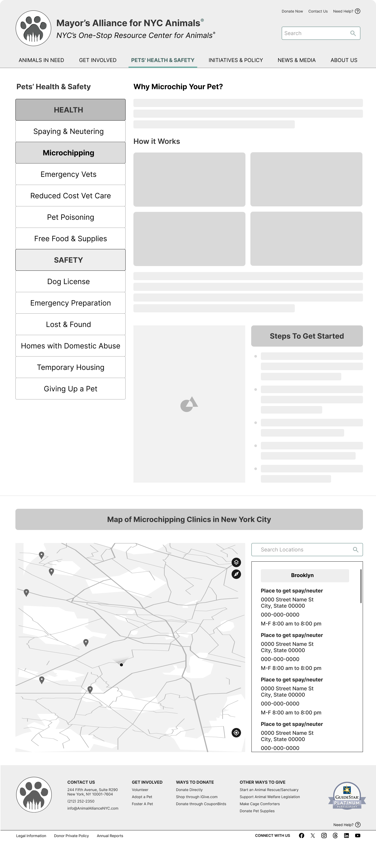
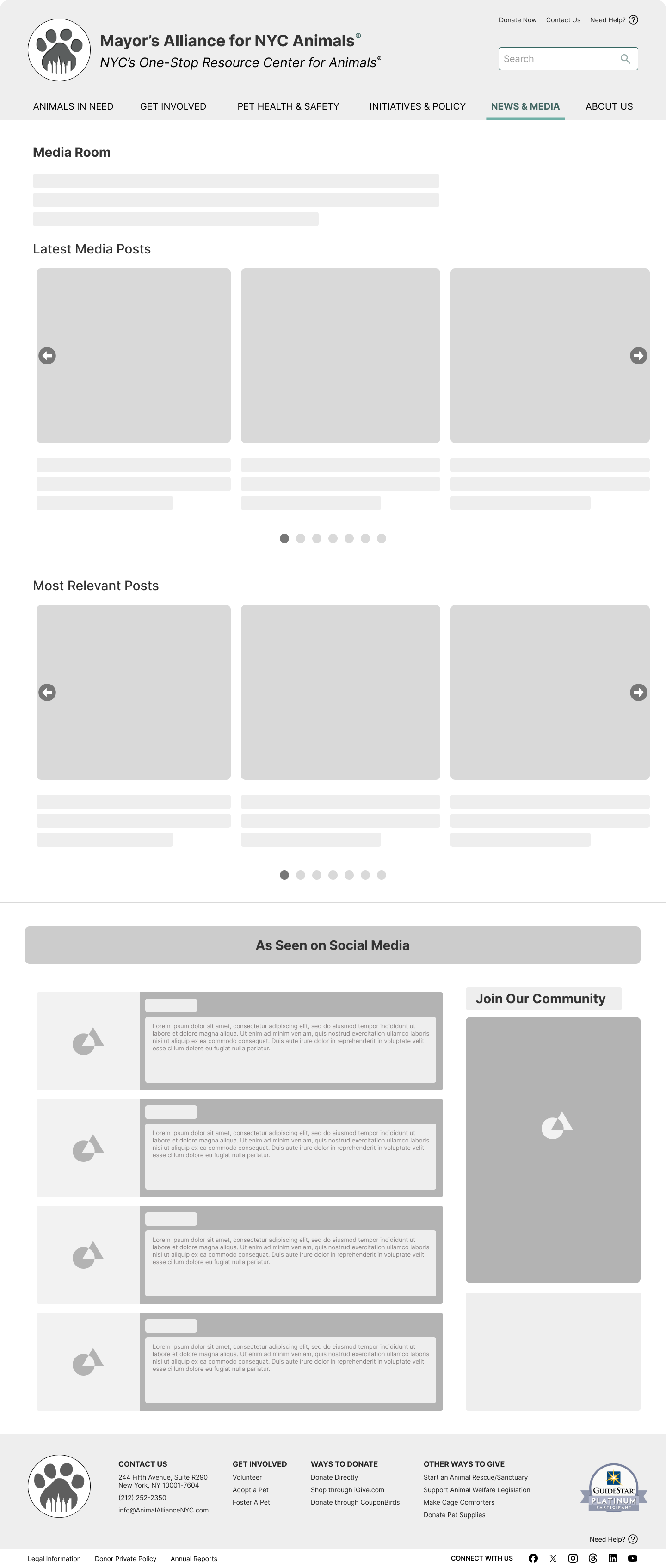
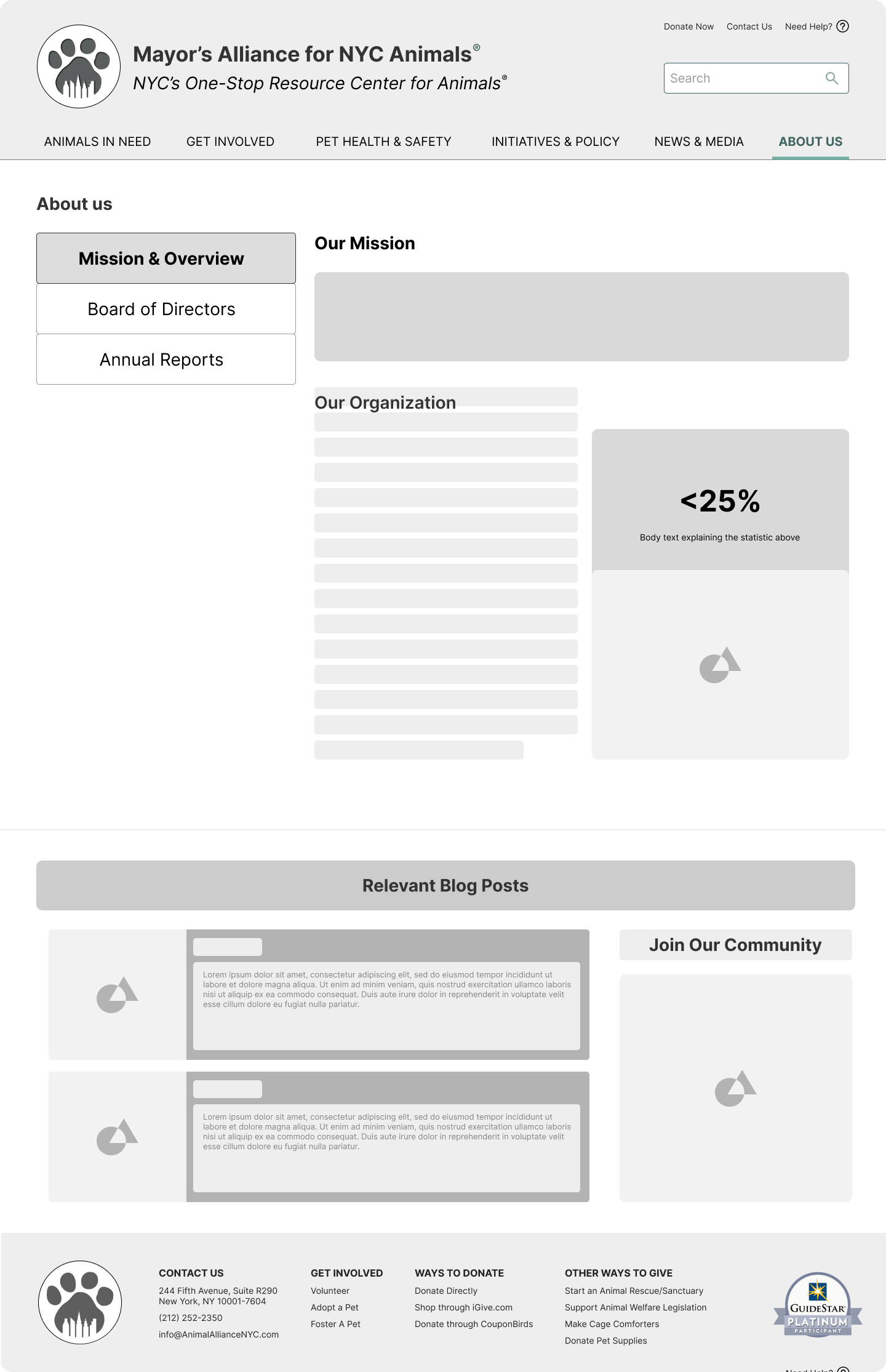
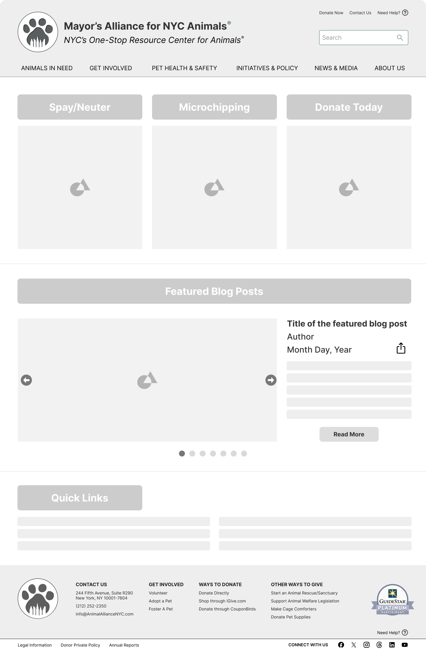
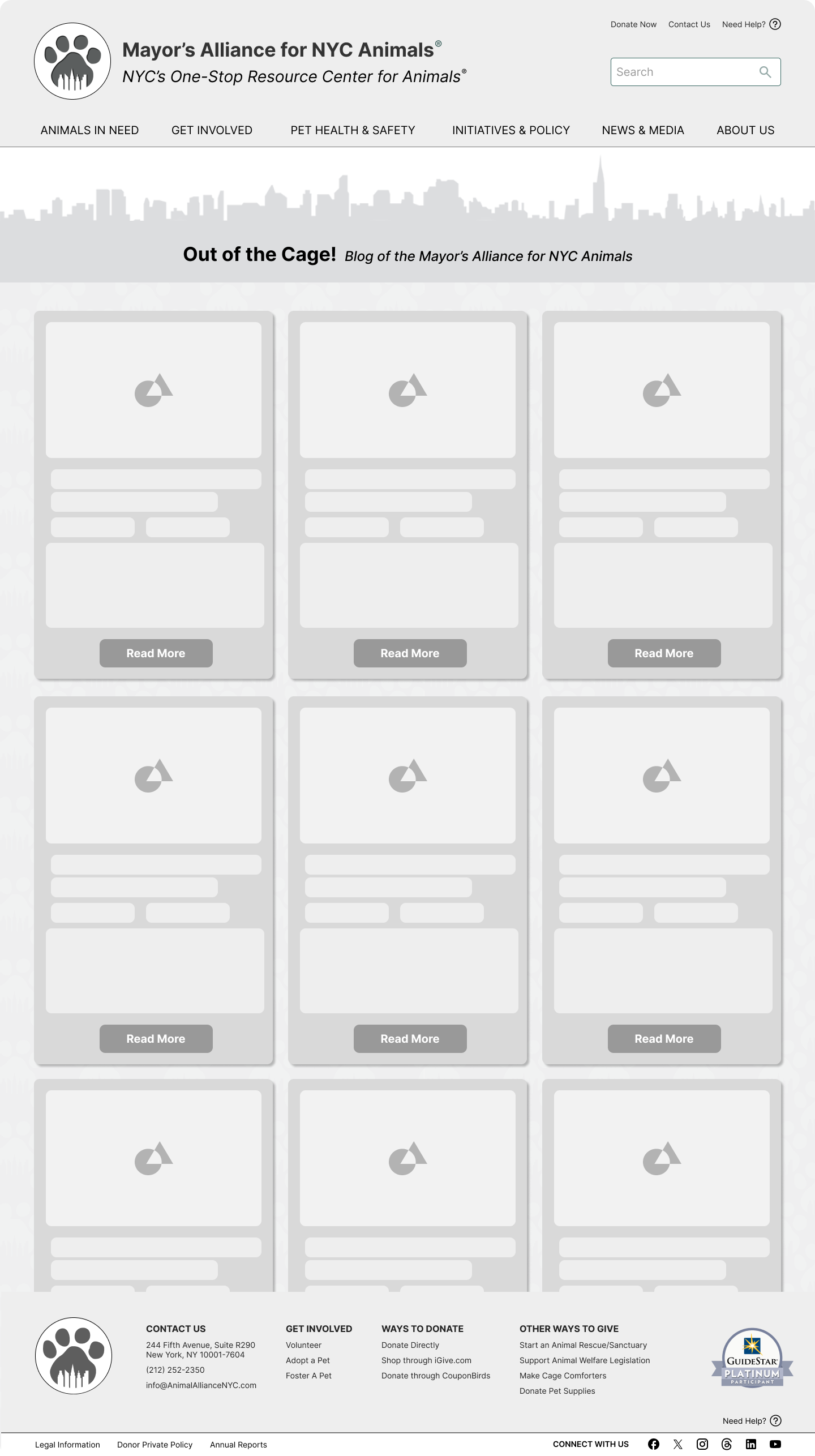
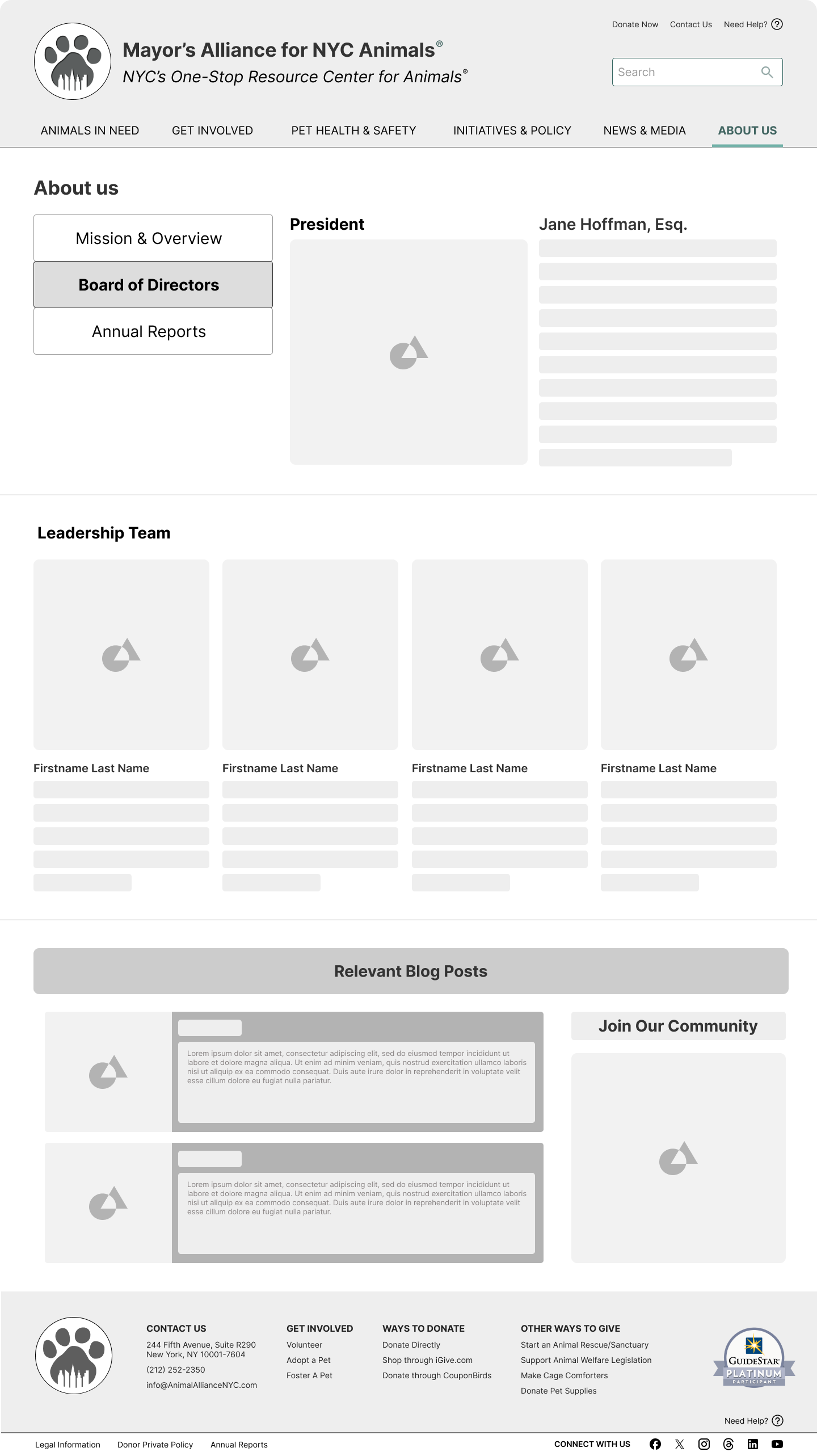
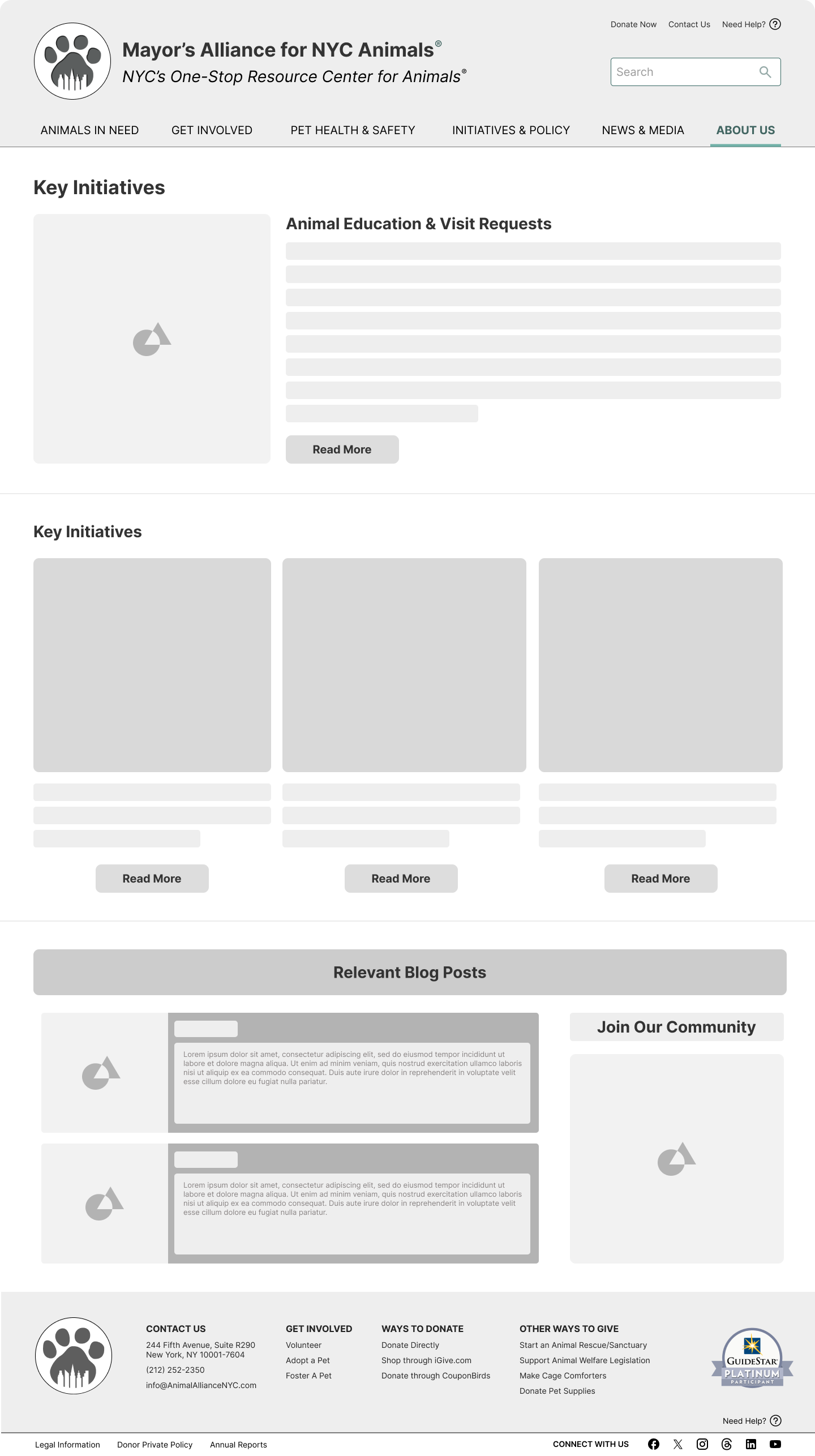
Scroll through the paper prototypes and low-fidelity wireframes we produced for the desktop version of the Mayor’s Alliance website.


The Design Guide
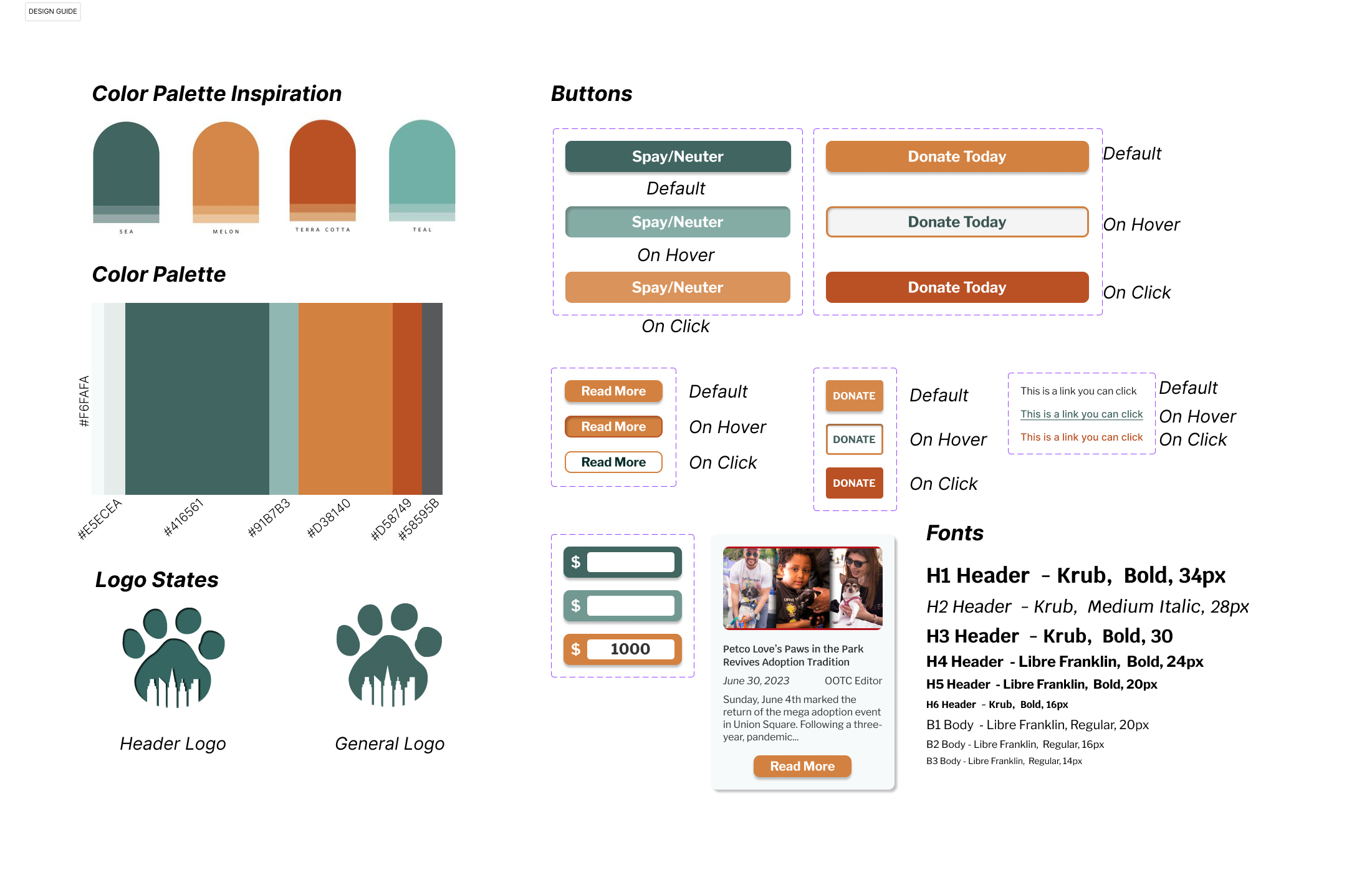
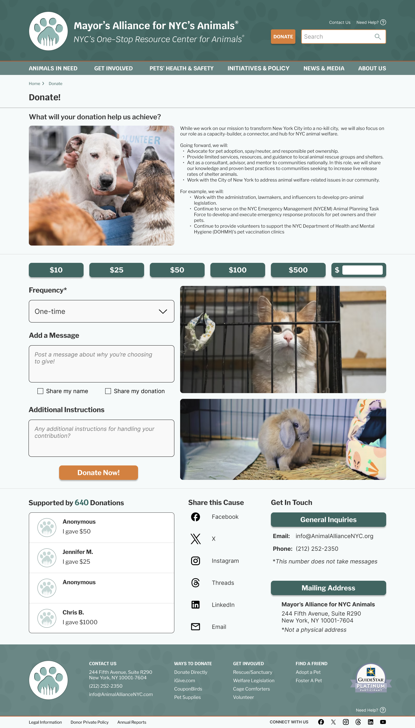
Color Palette: We decided to incorporate a mix of warm terracota highlight colors into a cooler, more sober sea-blue as the main protagonist.
Typeface: We went with a mix of Kurb and Libre Franklin styles to keep the overall vibe of the website airy and serious.
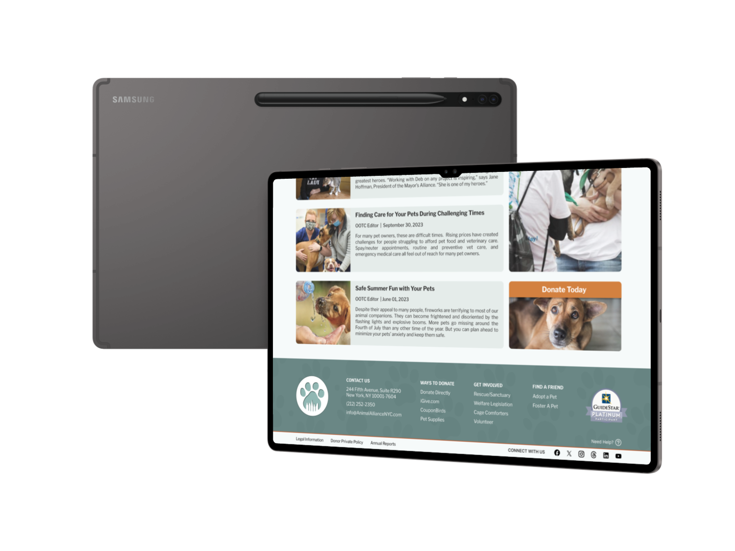
Logo: Finally, we decided to keep the logo the same, as a simple and effective way to maintain the integrity and mission of the NYC Mayor’s Alliance to the user.
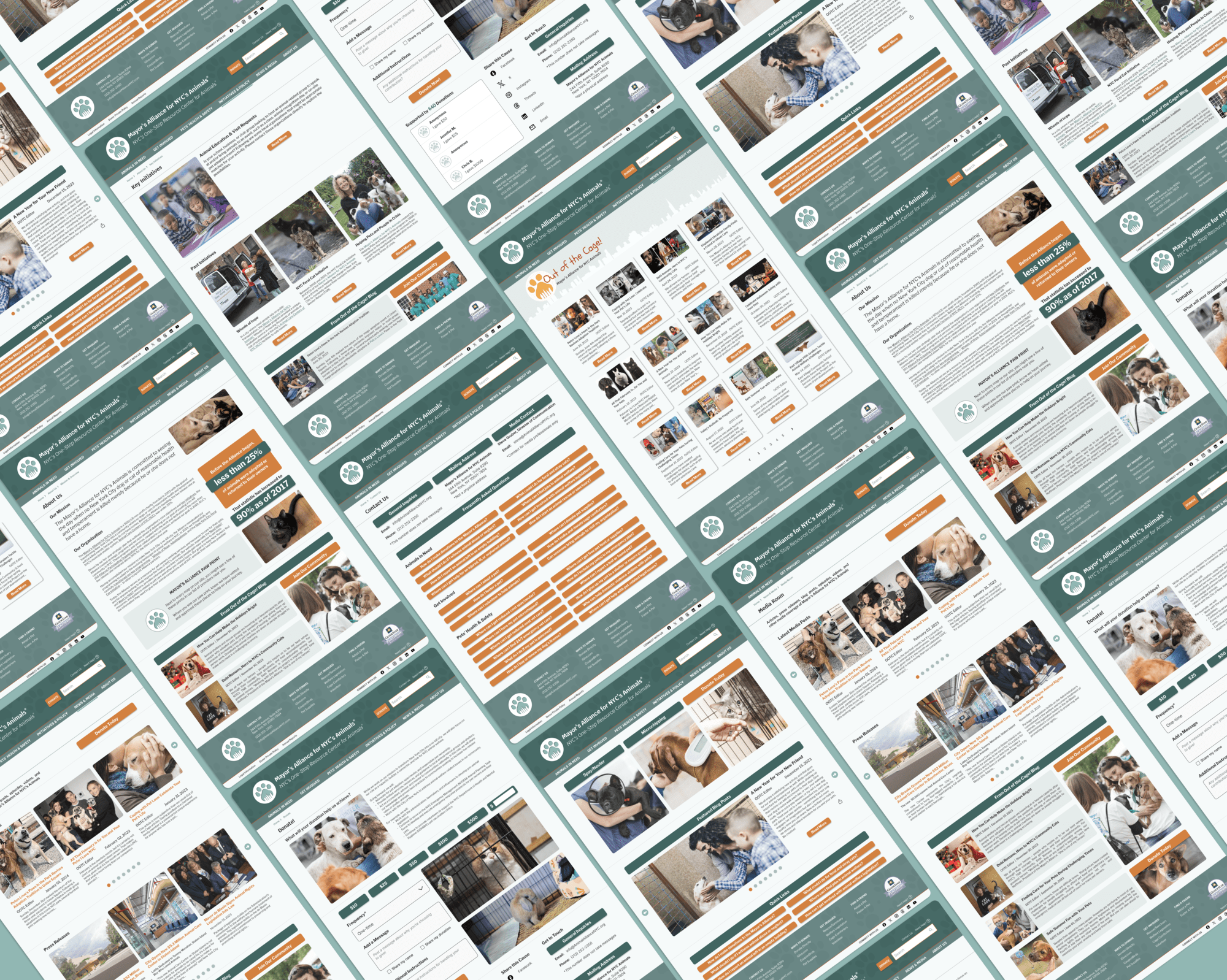
Below are the the High Fidelity wireframes we produced for the desktop version of the Mayor’s Alliance website.
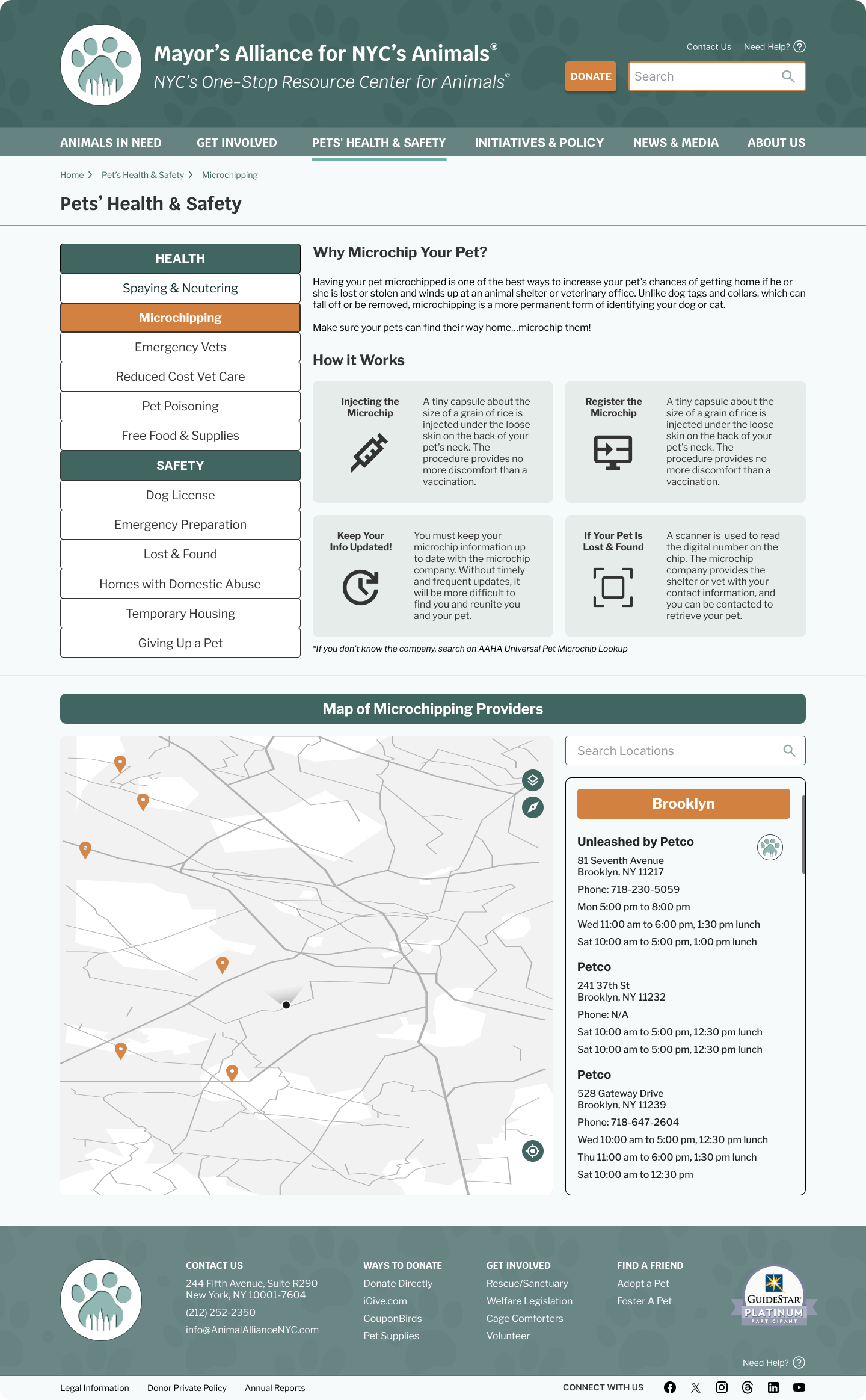
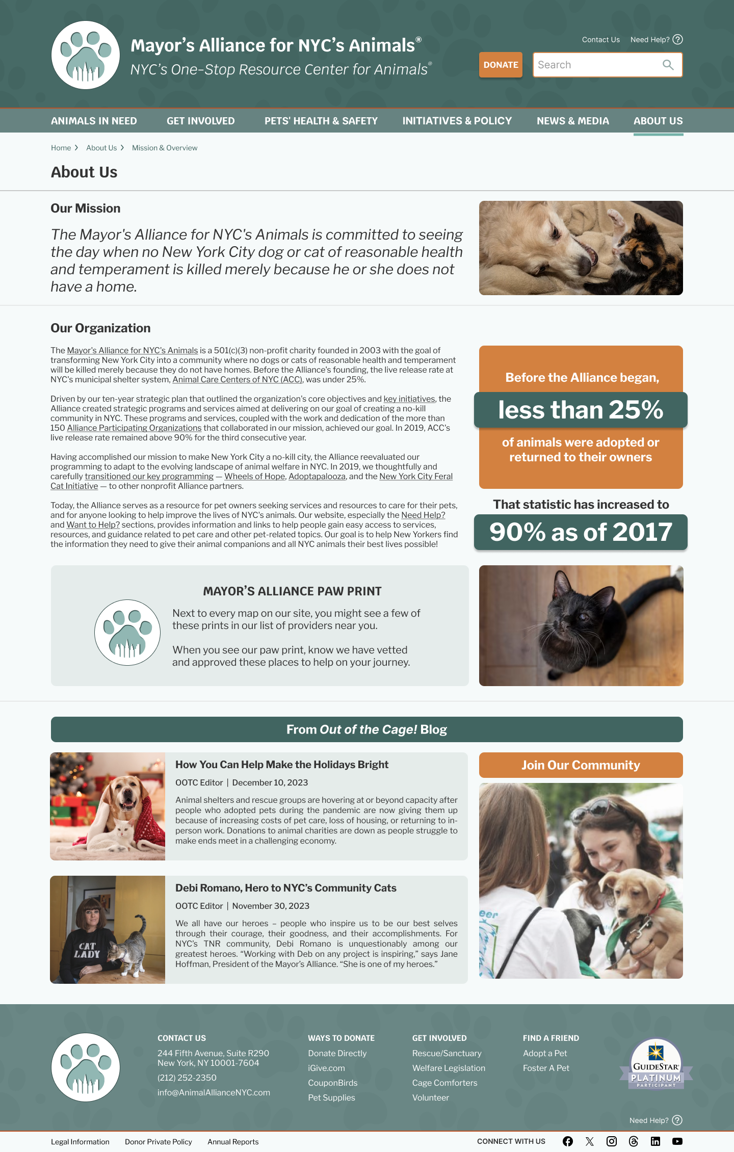


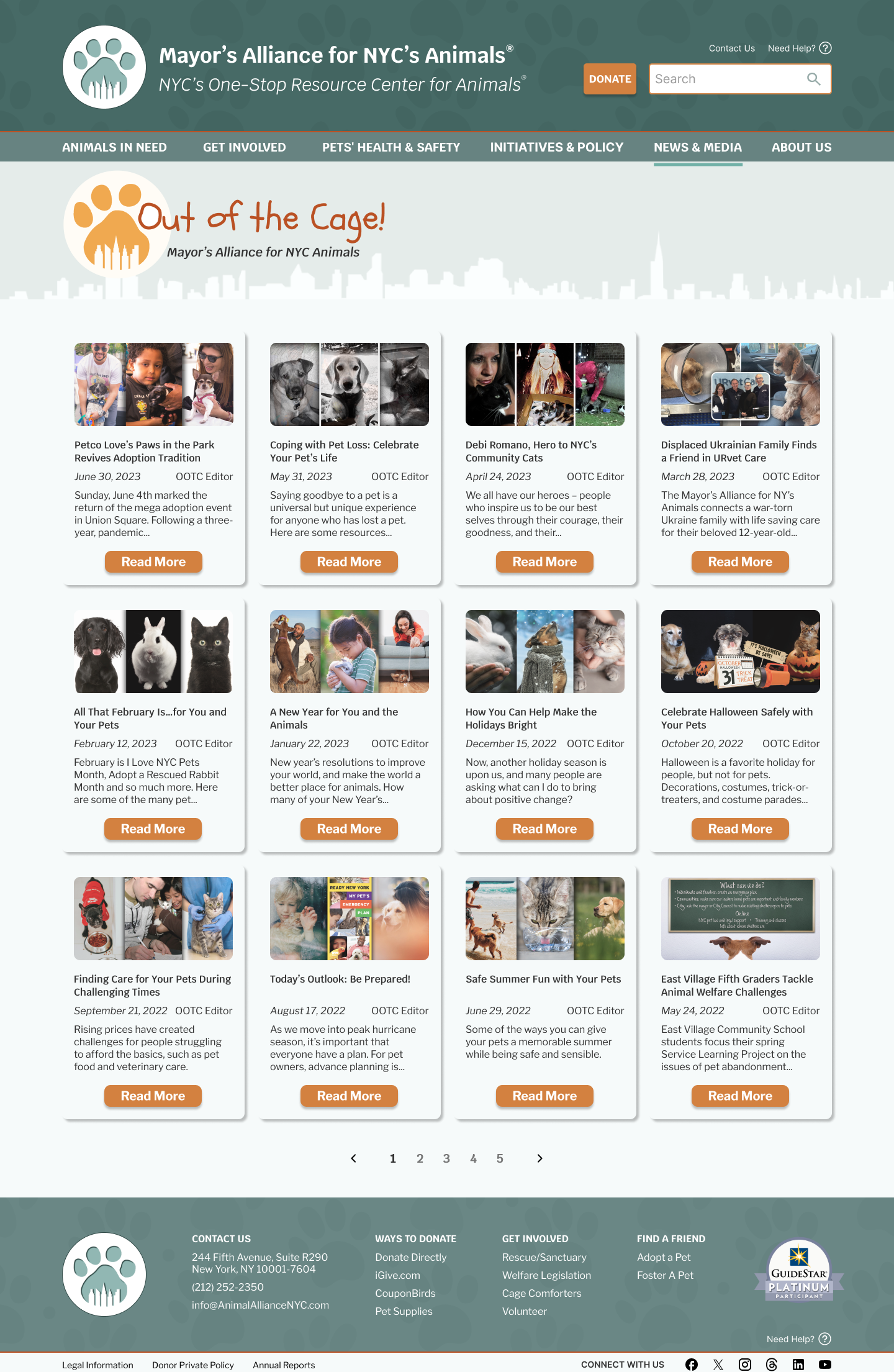
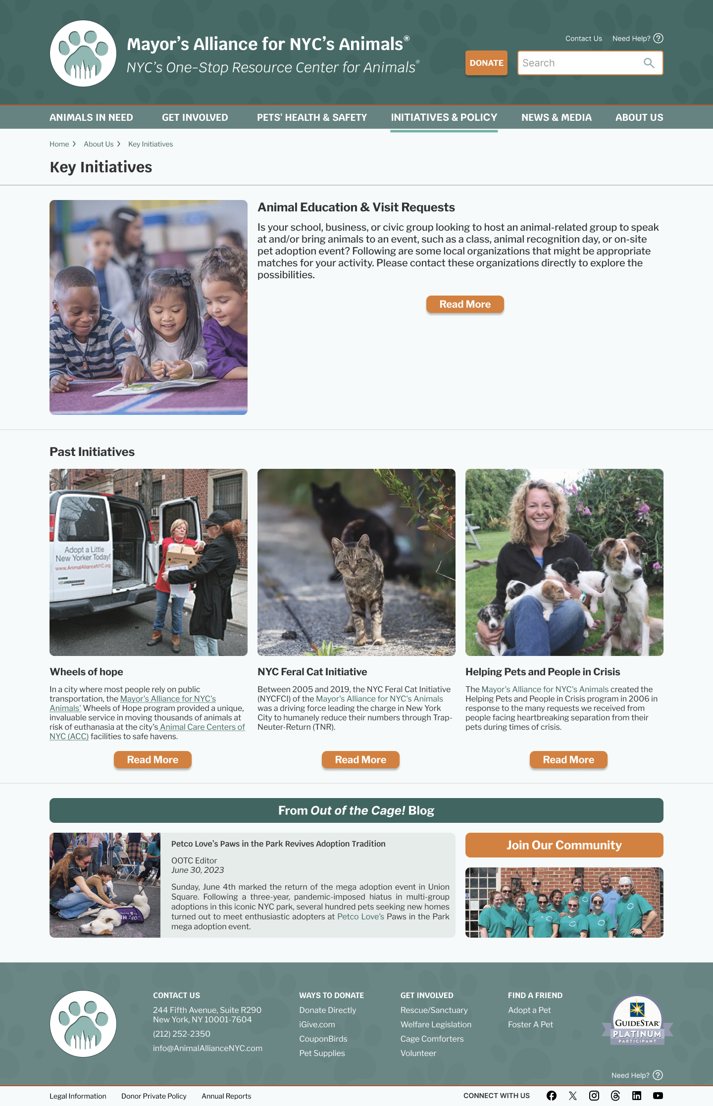

Part 5: Test
Clickable Prototype
From the UI design templates, we were able to generate an interactive high fidelity wireframe around finding medical help and resources for your pet, in and around NYC.
(Clicking through the prototype is best done in a computer)
Testing Results
Using the clickable prototype, we were able to test the website on potential users.
In a comparison analysis, 4/5 users were able to successfully access the Spay/Neuter page as well as the interactive map without setbacks. We received special praise on the new Nav Bar system, and the new site’s visual aesthetics.
The stakeholder was very happy with the results, and commented that we were able to maintain the “soul” of the original website, while making greatly-needed improvements.
Thank you for reading through my case study, feel free to reach out with any questions
-C

